News
Introduction:

In the realm of design and creativity, colour plays a pivotal role in shaping the visual experience. One of the cornerstones of colour standardization is the Pantone Colour System, a sophisticated palette that has become indispensable in various industries. In this blog, we'll delve into the origins and workings of the Pantone Colour System, its significance in design, and how it influences fabric choices. Plus, we'll explore the Pantone Colour of the Year for 2024 and take a sneak peek at the predicted colour for 2025.
The Genesis of Pantone Colours:
The story of Pantone dates back to the 1960s when Lawrence Herbert, the founder, worked in a New York-based commercial printing company. Constantly faced with the challenge of colour matching for clients, Herbert recognized the need for a standardized colour system. The Pantone Colour System was born out of this necessity, providing a universal language for designers, printers, and manufacturers to communicate and replicate colours accurately.
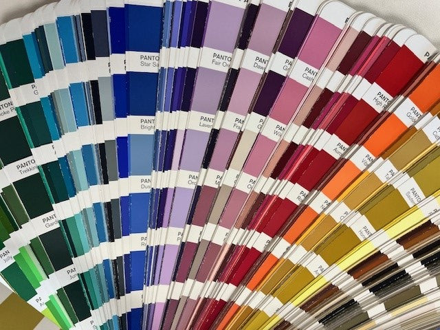
How Pantone Works:
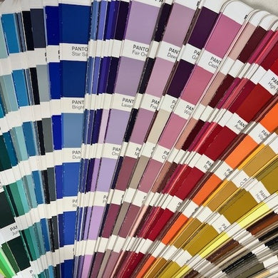
Pantone colours are identified by allocated numbers, each corresponding to a specific shade. With over 1,000 colours, including metallic and fluorescent shades, Pantone allows for precise colour specification.
Benefits of Pantone in Design:
The Pantone Colour System facilitates seamless communication between designers and manufacturers worldwide. Its standardization eradicates guesswork, ensuring that colours match regardless of location or production method. This reliability is particularly crucial in branding, where consistent colours are essential for maintaining a cohesive visual identity.
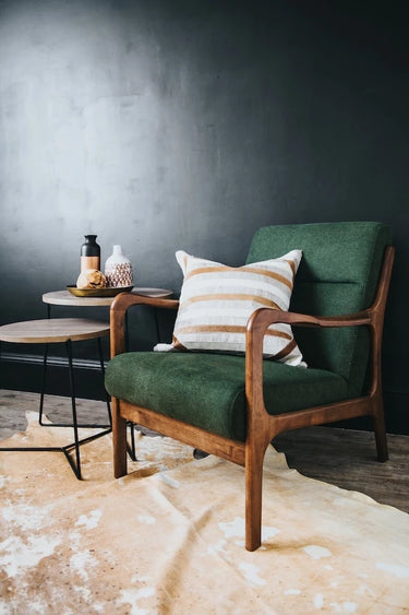
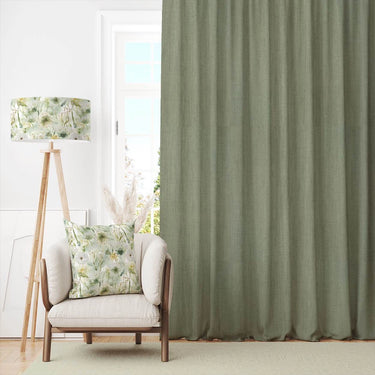
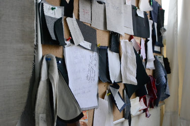
Pantone in Fabric Design and Printing:
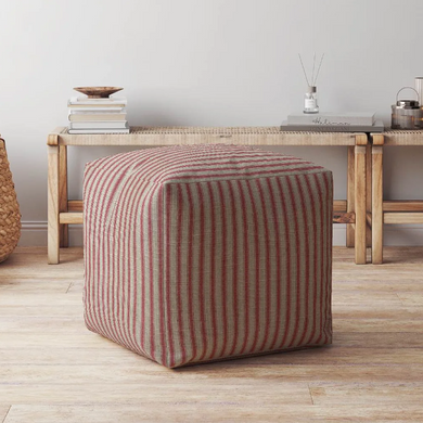
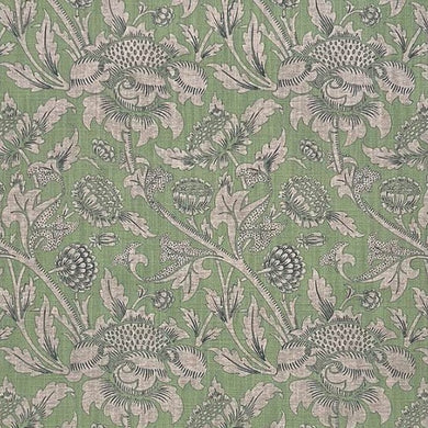
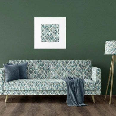
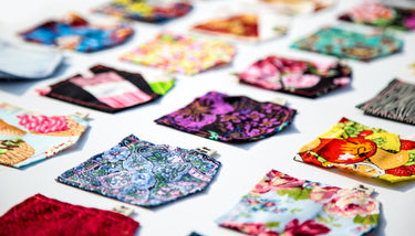
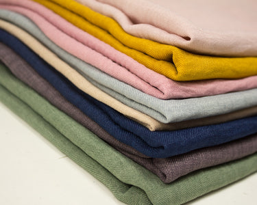
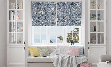
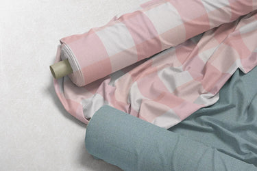
Fabric designers leverage the Pantone Colour System to meticulously choose colours for their collections. Whether for curtains, blinds, cushions, or upholstery, Pantone colours provide a reliable guide for achieving the desired hues. At The Millshop Online, the upcoming launch of a plain linen fabric range in an extensive array of Pantone colours will offer customers even more options to harmonize patterns and plains in their interior designs. Take a look at some of our colourful printed designs.
Pantone Colour of the Year 2024 and Beyond:
 The Pantone Colour Institute's annual Colour of the Year is a highly anticipated announcement that reflects current societal trends. For 2024, the chosen colour is PANTONE 13-1023 Peach Fuzz—a gentle, nurturing shade that encourages self-care and connection.
Looking ahead to 2025, the predicted colour, PANTONE 17-3812 TPX Dusk, suggests a moodier, transitional hue with undertones of mystery and escapism. 
Conclusion:
In the colourful universe of design and fabric, Pantone stands as a guiding force, offering a standardized language for expressing creativity. From its humble beginnings in a New York print shop to its global influence today, Pantone continues to shape the way we perceive and interact with colour. As we eagerly await the unfolding trends in the world of Pantone, one thing is certain—it will continue to be a vibrant source of inspiration for designers and enthusiasts alike. Watch this space for more hues, more stories, and more possibilities!